echo exhibitions
An AI-powered data visualization interface that maps 25 years of MoMA and MoMA PS1 exhibition history through recurring curatorial themes.
Scope: Research, scraping pipeline, taxonomy design, Claude concept extraction, data normalization, UI/UX
Dataset: 1,125 exhibitions, 2000–present, MoMA + MoMA PS1
Tools: Node.js, TypeScript, Cheerio, Axios, Claude API, React + Vite, Cursor
echo exhibitions
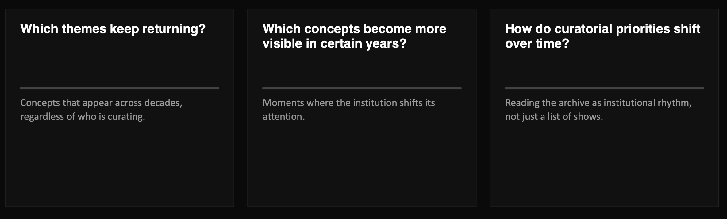
An AI-powered data visualization interface that maps 25 years of MoMA and MoMA PS1 exhibition history through recurring curatorial themes. The project transforms chronological exhibition records into a searchable concept system. Using scraped public exhibition data and Claude-based concept classification, Echo Exhibitions reveals how themes appear, repeat, shift, and diverge across MoMA and PS1 over time.
A way to turn exhibition history into comparative institutional analysis.
Taxonomy design
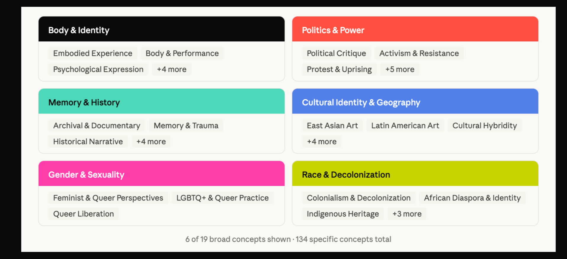
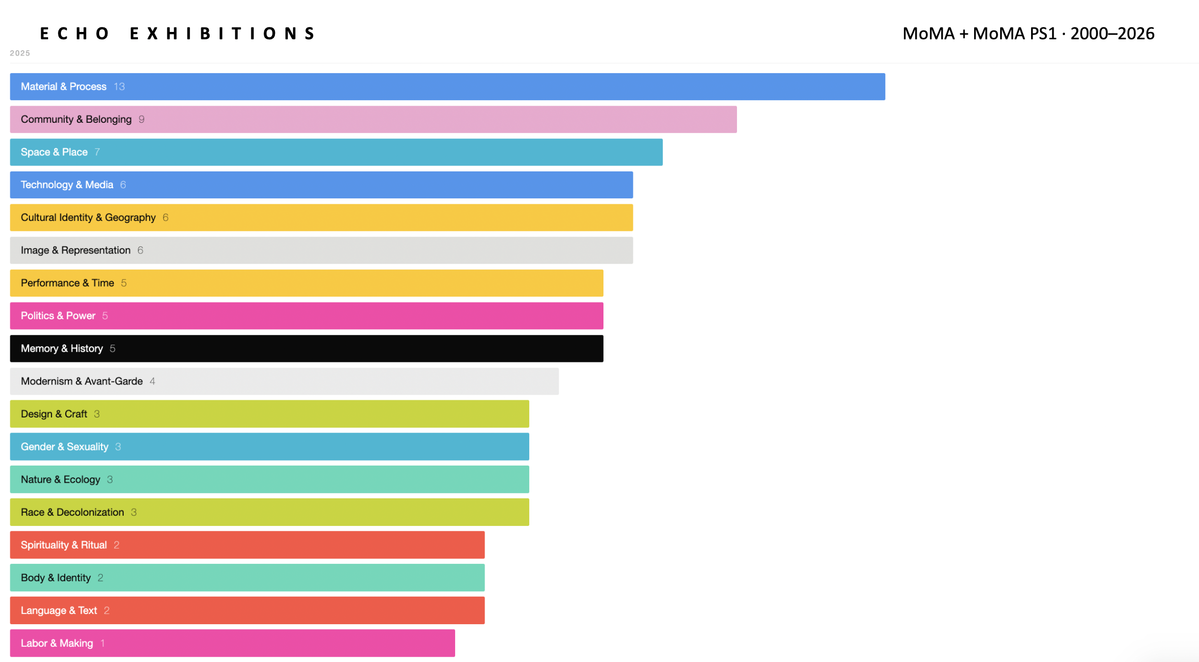
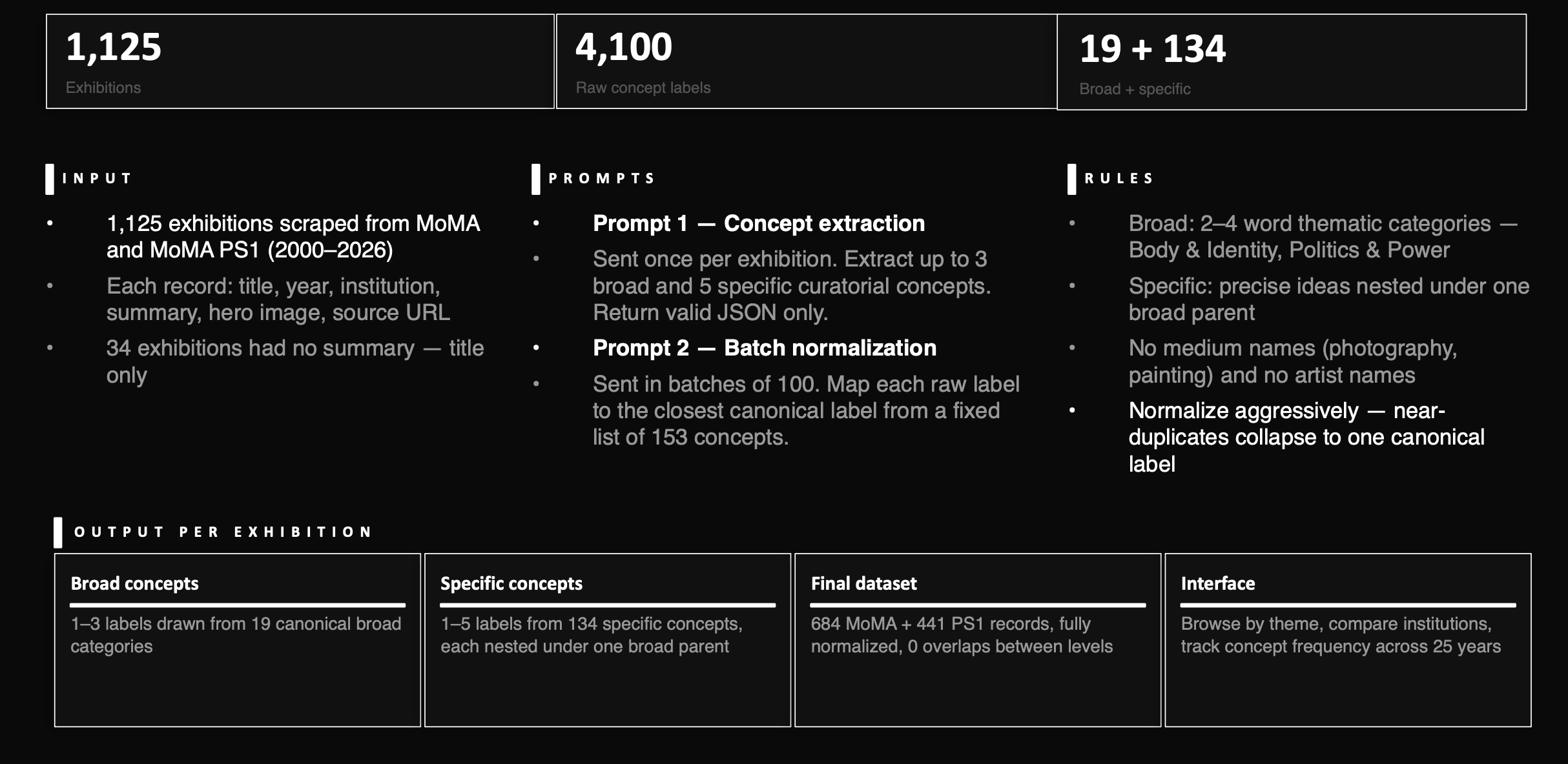
The interface is built around a two-level taxonomy: 19 broad categories and 134 specific concepts. Each specific concept sits under exactly one broad parent, so the archive stays flexible enough for discovery but structured enough for comparison.
Product walkthrough
Concept browser / main page
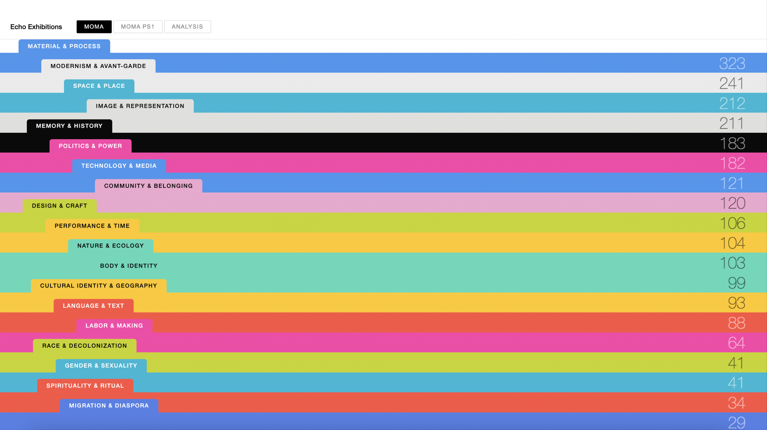
Users can enter the archive through a concept rather than a date, exhibition title, or institution. Themes like Material & Process, Technology & Media, Race & Decolonization, and Memory & History become entry points into exhibition history.
From concept to exhibition record
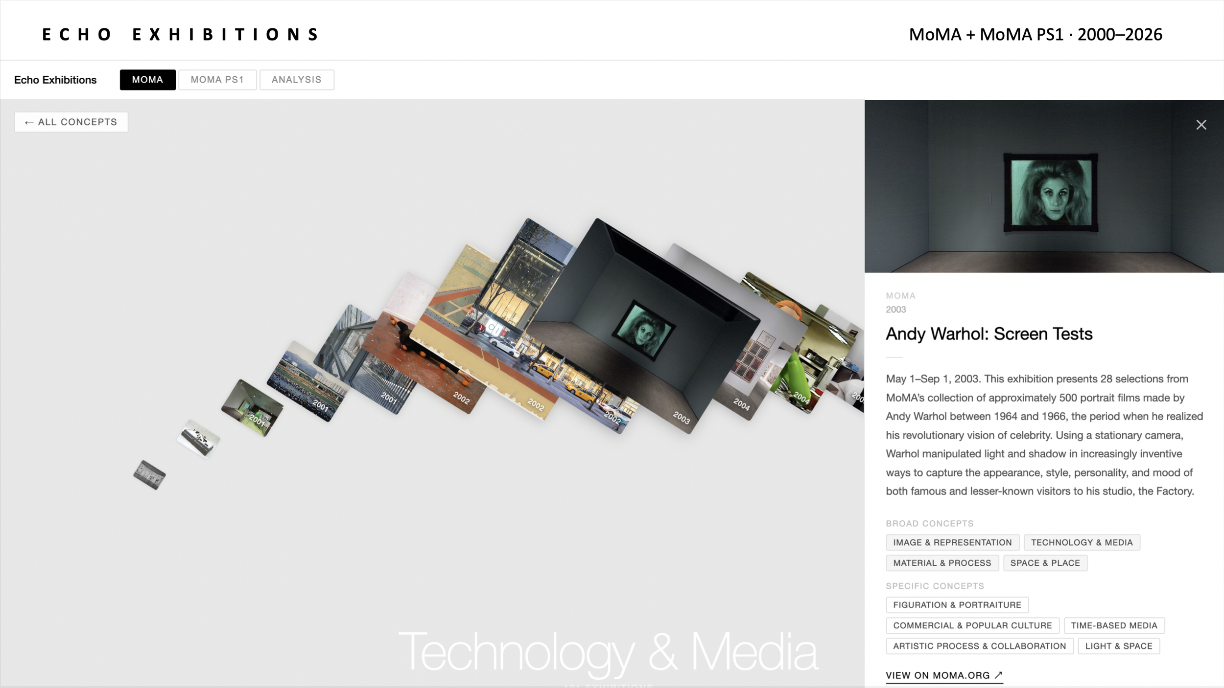
Clicking into a concept opens a chronological list of all exhibitions connected to that theme across MoMA and MoMA PS1. Users can scroll through the exhibitions over time, moving from a broad curatorial category into individual exhibition records.
Each exhibition card includes the exhibition image, institution, year, source link, and a short exhibition brief. Because most exhibitions carry multiple concepts, each card also displays both broad categories and more specific concept tags. These tags are clickable, so every exhibition becomes a navigational node: users can jump directly from one theme into another related pathway through the archive.
See what themes dominate a year
For any year, the interface shows which broad concepts appear most frequently across MoMA and MoMA PS1. This turns exhibition history into a readable snapshot of institutional attention.
Track concepts over time
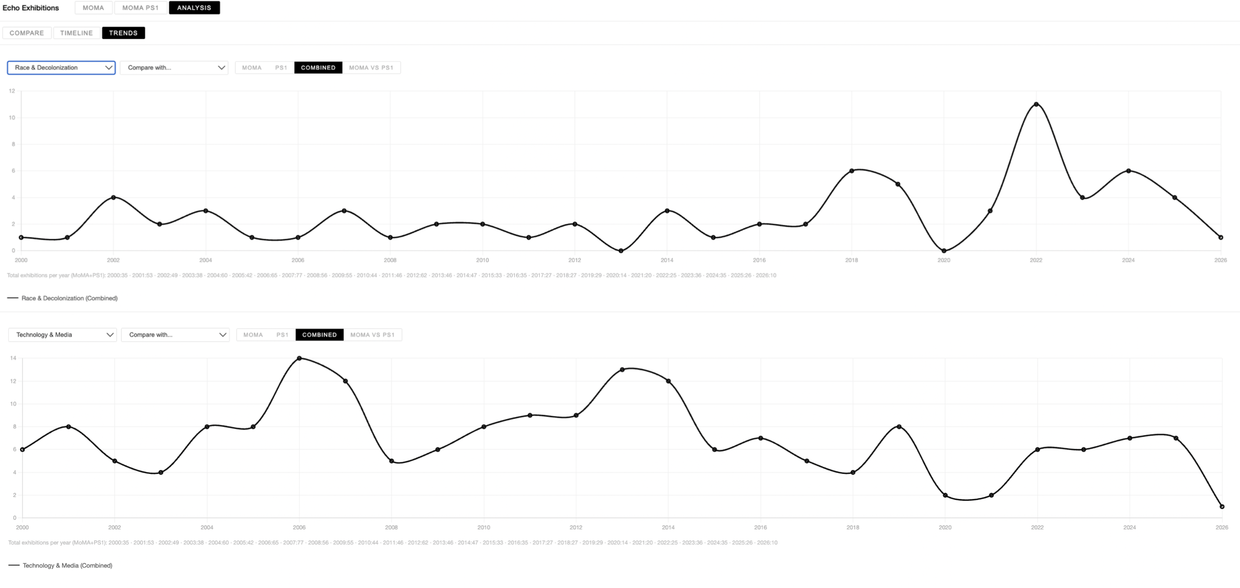
The analysis view counts how many exhibitions address a theme each year. Users can compare one theme against another, or compare MoMA and PS1 separately, making shifts in institutional focus visible across time.
Comparative institutional analysis
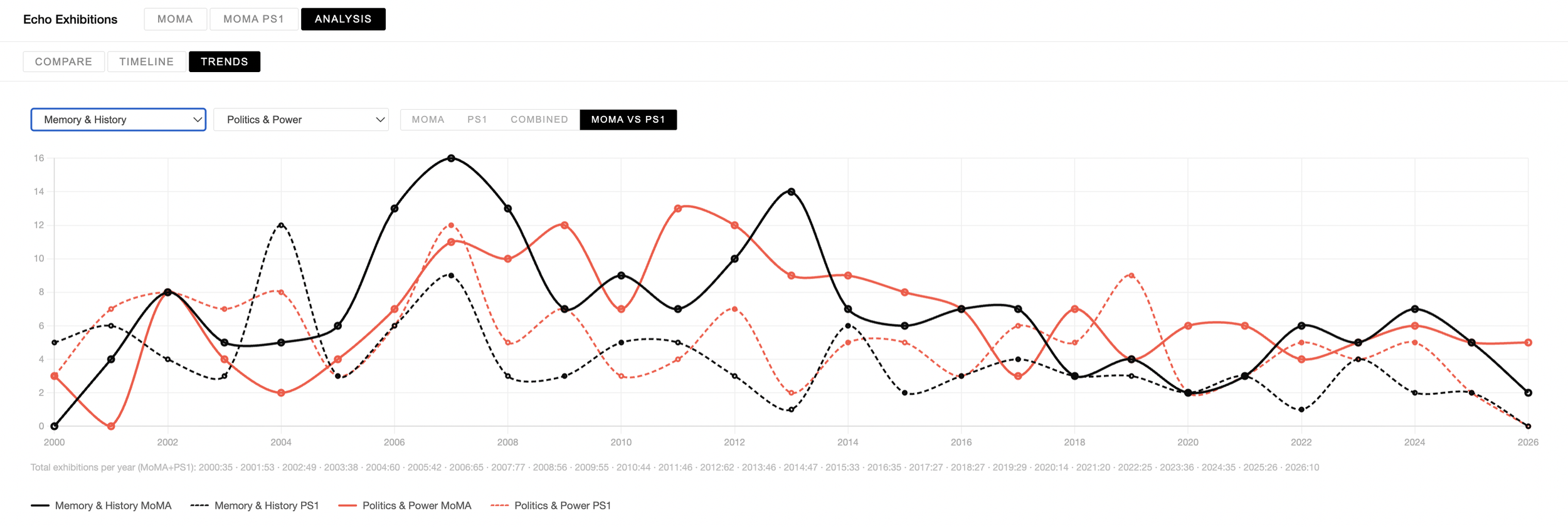
The comparison view shows how often each institution returns to different curatorial themes. Rather than treating MoMA and PS1 as one combined archive, the project makes their differences legible: which themes are shared, which are institution-specific, and where their curatorial rhythms diverge.
This slide is useful because it shows the “analysis” part of the project, not just the browsing interface.
Workflow / Pipeline
The project starts with public exhibition records from MoMA and MoMA PS1: titles, years, summaries, images, and URLs. Claude reads each exhibition title and summary to assign broad and specific curatorial concepts. Those concepts are normalized into a two-level taxonomy, creating the structure behind the interface: folders, tags, exhibition lists, timelines, trend charts, and institution comparisons.
Final outcome
The final prototype turns exhibition history into a comparative research interface. Users can browse by concept, click into a theme, scroll through related exhibitions chronologically, and compare how MoMA and PS1 engage with different ideas over time.
The project uses AI to create the thematic structure behind the archive, making institutional patterns visible through data visualization.